Most of us, perhaps, were not so lucky as to grow up knowing psychological terms. It is such a vast world of knowledge, yet it is always important that we know at least the classical theories of psychology or some basic ones.
Psychology is not just about mental health because it’s the study of our mind and behavior. It can be so fascinating. You will find that many famous companies, production houses, or businesses have been using psychology to their advantage without our being aware.
This post will talk about some of the examples based on a particular psychological principle called continuity psychology. Now, what is continuity psychology? To understand this, let’s take a step back.
Table of Contents
What is Continuity Psychology?
Continuity psychology is one of Gestalt psychology laws, which itself is a set of 7 main laws, which is a psychological term known as ‘school of psychology.’
Continuity Psychology law is based on a human mind’s ability to experience and perceive visual lines of elements grouped, say – a pattern. And when that physical pattern or real, existing pattern ends, there is a tendency of our brain to visualize the non-existent line to connect to the other elements. This can also mean seeing a whole picture with separate elements rather than seeing the separate elements as they are.
The design industry has taken great advantage of using this theory in their business. Let’s take a look at some of the continuity psychology examples.
Product pages of an online marketplace

Have you ever noticed the items listed below when you are viewing a particular product on Amazon? It is mostly seen under the title, ‘Customers also viewed these products’, and there will be a list of other items. Scrolling right or left will show you more products. There is a continuity process going on, and Amazon uses this process to establish that the products below are similar and related to each other.
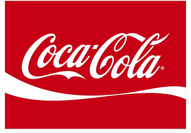
The logo of Coca Cola

When we look at the first C of Coca, it leads us to the next word Cola, then again, we follow the C from Cola, leading us through two other letters L and A.
This way, it helps us to move through the whole word.
The logo of Amazon

The logo of Amazon is an interesting one. As soon as we see the first letter A, it shows us an arrow leading to Z, as in A to Z. A and Z, by the way, being the first and last letter of our English alphabets, respectively, means that this marketplace provides all items from A-Z.
The logo of IBM

Take a close look at the logo of IBM. But I guess it is not needed because you will immediately see blue horizontal lines saying IBM even though they are pieces of random lines, not even connected.
The logo of Petsmart

This, too, is one of the logos where they used the law of continuity to create something interesting. PetSmart is an online mart where you get pets, but their logo reads more like PetSmart rather than PetsMart.
Conclusion
Do you wonder why we, or say our brain tends to see things a bit differently than the way they are? It is because the human mind is lazy during certain times and looks for a path to reduce the visual stimuli. Designers who can use it in their artworks have control over the people to make them perceive their work the way they want.